Conversions make and break every online store.
E-commerce stores often operate on thin profit margins, so every sale counts.
You literally cannot afford to lose thousands of dollars every month on ineffective marketing efforts.
That means you should have a sense of urgency of keeping your profits at a desirable level by using conversion optimization tactics that actually work.
Fortunately, conversion optimization is a straightforward process and we have compiled all of the techniques you need to begin increasing your annual revenue.
Are you ready?
We’ll explain them all in detail here below.
1. Avoid Clutter
When people visit your online store, they expect to easily navigate and find the products that they are looking for.
In fact, e-commerce websites with simpler web designs achieve higher conversion rates.
The reason why simpler web designs are effective is that these websites help visitors instantly find your call-to-action (CTA) and go straight to checkout.
Apparently, a lot of online stores aren’t following this format.
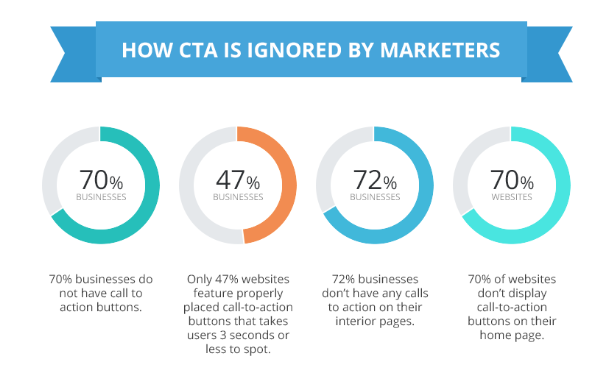
According to the chart below, 53% of websites have CTAs that take three seconds to find.

Avoiding clutter is the first step to reducing friction and improving user satisfaction. Both are ingredients for a healthy conversion rate.
2. Simplify Your Menus
Menus help websites stay organized.
It’s commonly discouraged to include a lot of menus on your website.
But, there is an exception if you are trying to promote specific products.
For example, if you’re pushing a seasonal sale and want to sell more dresses, sandals, and hats you can include those category pages in your menu.
Now, let’s say that you sell multiple types of dresses…
You can condense all of those category pages into only one menu item.
That’s the best way to deliver simplicity and value to your web visitors.
3. Add a Search Bar
Adding a search bar to your online store can help web visitors find products more conveniently.
For example, web users looking for grey cabinets may have no clue about the actual name of the product they need.
Without a search bar, your visitors will spend countless minutes searching for the products they’re looking for.
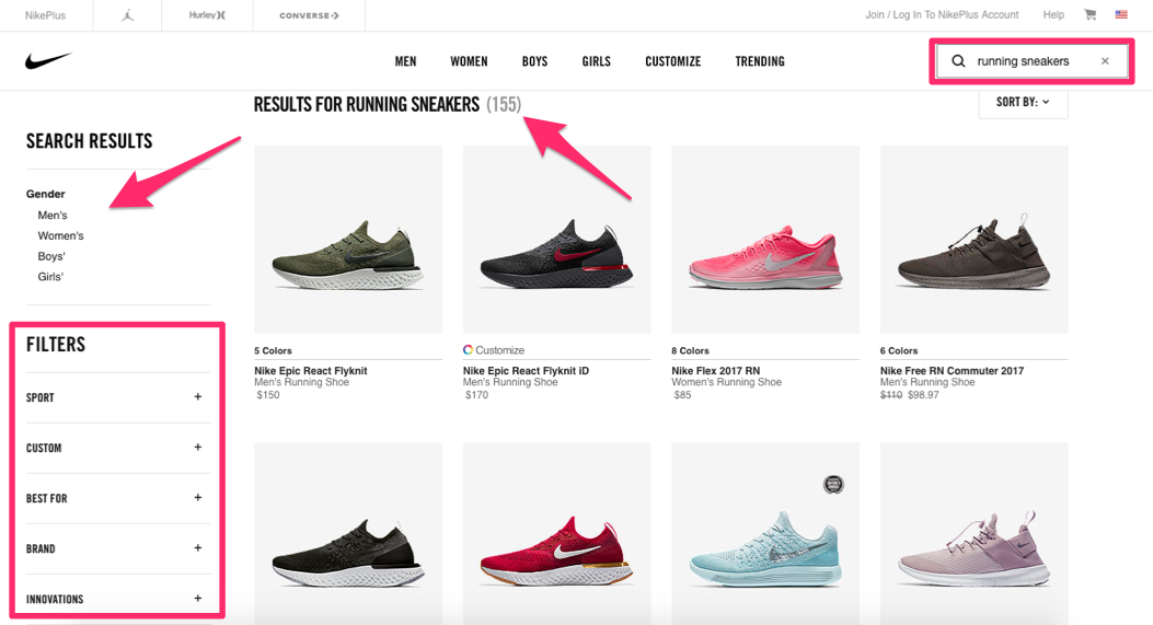
This is why Nike added a search bar to their website along with a filter to allow visitors to refine their searches.

Adding a search bar may reduce dwell time, but it will go a long way in helping visitors navigate to checkout.
And, that will eventually pay off in the long run.
4. Improve Your Website Speed
Having a lightning-fast website is a huge requirement nowadays.
If your website has a two-second delay…
You’re going to be in really big trouble!
With that said, invest heavily in improving the speed of your website.
This will mean hiring a web agency to develop a website that has all of the technical aspects to rank well online.
5. Remove Unnecessary Steps in the Checkout Process
Once a web visitor decides to purchase something, they should quickly navigate through the checkout process.
It is in your best interest to ensure that this happens.
You should only collect pertinent information such as shipping and billing information and avoid asking for a mother’s maiden name or the like.
Doing so will allow web visitors to quickly find what they’re looking for and checkout.
6. Don’t Force Shoppers to Create a Profile
Again, you should make the checkout process simple.
Guest shoppers should be able to checkout with relative ease.
With that said, don’t force shoppers to create a profile in order to complete their transaction.
However, you can encourage them to sign up to make the process easier.
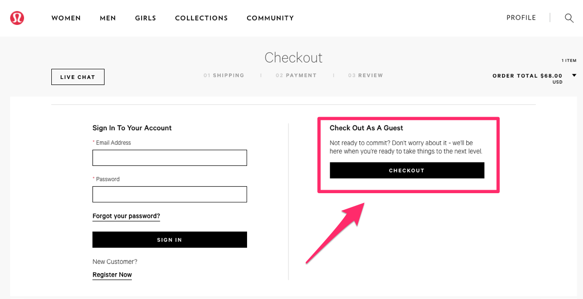
Check out how this retailer did this.

By signing up, shoppers can take advantage of a convenient checkout process.
Though, they aren’t forced to sign up if they don’t want to.
This is a great way to encourage sign-ups without annoying web visitors.
7. Send Abandonment Emails
It’s important to realize that not everyone will convert.
Even qualified leads will stall and even show disinterest over time.
This happens to the best of us, so don’t sweat it.
Though, in order to follow qualified leads closely through your funnel, you can send abandonment emails to those who leave their shopping carts behind.
Doing so will enable you to understand why they abandoned their cart so you can sweeten the deal.
For example, if a potential customer wasn’t satisfied with the price, you can send an abandonment email promising to send future updates about deals relating to the products they left behind.
And, just like that, you can convert a cold lead at a later date.
8. Prioritize SEO
46% of consumers begin the shopping process on a search engine.
That means it’s never been more important to develop an SEO strategy for your online marketplace.
SEO campaigns build awareness and divert web traffic from search engines to your online store.
Just because you run an e-commerce website does not mean you can forget about SEO, especially if you’re running PPC ads.
PPC ads work amazingly well in cohesion with a high-performance SEO campaign.
9. Get Rid of Ads
Hosting ads on your website may be an excellent way to build affiliate income for your online store, but it can be quite disruptive to newer generations.
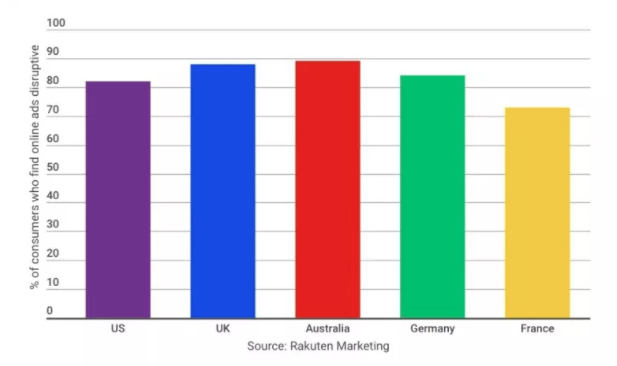
Just take a look at this chart.

Almost 82% of American consumers believe that e-Commerce ads are disruptive.
Enough said, right?
Set your priorities straight.
Transactional income is more beneficial to your bottom line than affiliate income.
Improve Your Conversions Today!
As you can see, optimizing your e-Commerce website takes a lot of work.
Luckily, Optuno provides incredible website creation services for online stores.
To speak to a member of our dedicated sales team, give us a call today at 1-888-678-8662 or click here to schedule a free consultation.


 View Printer Friendly Version


