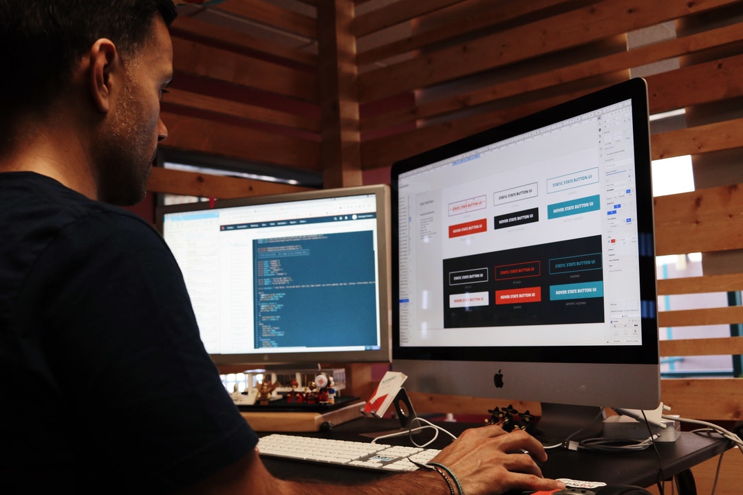
Designing a great website starts by considering the user experience first. There is an influx of users making purchasing decisions and entertaining themselves on the internet due to the pandemic. Brands are pressed harder than before to differentiate themselves from competitors.
One of the best ways to do this is by focusing on user-friendly web design. Through a seamless browsing experience, you can use strategies that encourage users to engage with your website in order to get the most out of it.
Read on to learn the top current website trends this year that can increase user engagement and boost your website's rankings!
Parallax Animation
Web-animation has been increasing in popularity as more people have speedier internet and device access. Unlike static web pages, websites that are animated help draw the eye to the areas you want them to look and navigate to next.
Parallax, specifically, is an optical illusion that creates an almost 3D effect while people are browsing and scrolling. It makes it look as if there is a foreground and a background.
Just like in a car or walking down the sidewalk, foreground objects appear to be moving faster than those in the background. This creates a more immersive environment that engages viewers and encourages them to stay on the web page longer.
Multichannel Strategies
Multichannel marketing means that you're able to interact and engage with customers on a variety of channels. This makes it easier for them to engage with your brand, as everyone has a preferred method of communication and connection.
This means that you're focusing on an SEO strategy in order to rank better in search engine results pages (SERPs). However, you're also ensuring that you're posting regularly on social media, producing email marketing campaigns, offering text deals, and more.
Micro-Interactions
Micro-interactions are the minute interactions that users experience on your website. They should be seamlessly blended within the functionality of the website so that users barely notice or register them. They can be as simple as an article progress bar that lets users know how far along they are while reading a long article.
Here are a few examples of micro-interactions:
- Including hamburger menus and smooth open/close animations
- Chat bubble animations
- Action button interaction animations
- Animations that show the progress of a page loading
- And more
You can see how all of these micro-interactions help give the user feedback on what they're clicking on. This encourages them to keep engaging with your site because everything does as they expect.
Calming Colors
Although there are a variety of brands and websites that are vying for customers' attention and money, designers are realizing that loud colors are turning people off.
With the desire for more transparent and genuine companies, bold colors today may seem like a pushy sales tactic used by car dealerships.
With this in mind, web designers are moving towards calming colors instead such as pastels, pale greens, and deep blues. Not only does this help websites become more accessible and comfortable, and also helps relieve Zoom and screen fatigue that people are experiencing due to the pandemic.
Eye-Catching Typography
You'll find that more brands than ever before are using bold typography in order to make strong statements about their brands. Typography also serves a functional purpose.
It draws a user's eyes towards particular areas on the screen. This compels them to engage and interact.
It's important to keep in mind that bold, large text can't replace contextual calls-to-action and entertaining website copy. You'll need a combination of the two in order to create a compelling website.
Asymmetrical Design
If you've designed your own website in the past, you probably remember the simple, default WordPress templates. Those had content that typically went down the center with a large header at the top. Meanwhile, your widgets and other content would border the left and right sides.
Although this web layout is straightforward, it also means that users can quickly become bored. They may believe they've seen everything.
Asymmetrical layouts subvert people's expectations, encouraging them to engage and explore in order to uncover the content they're looking for.
Even better, asymmetrical design can easily add character to a website and develop a memorable brand. This can help you differentiate your company from competitors.
Motion Design
With the renewed interest in short-form video, people more than ever before are eager for video content on their favorite websites and apps. Smartphone technology is also progressing so that more people have affordable access to 5G internet speeds.
With this in mind, more brands are using designs that don't just focus on static images and graphics. They're using a combination of video, GIFs, and more in order to create websites that seem alive.
This helps give users a breadcrumb trail to the next area you want them to navigate. It also encourages them to keep engaging.
Try These Website Trends for Increased Engagement
Engagement means that people won't just click on your website, spend a few seconds on a single page, and then click back out. Through the use of these strategic trends, people will interact and engage with your website in order to discover more information, place an order, and more.
You'll be able to decrease your bounce rate and build rapport with leads. Even better, an engaging website has an easier time converting casual browsers into loyal customers.
It's important to keep in mind that increasing engagement is a subtle process. It takes many tweaks and a good understanding of your target audience.
However, with the help of AI, surveys, and studying website trends, you can make smart decisions that will increase your engagement for the long term.
Ready to transform your website so that it works for you? View all of our plans and pricing today to get started!


 View Printer Friendly Version


