The vast majority of your potential customers—93 percent, in fact, say that what they see drives their purchasing decisions. And of that visual impact, 90 percent of that is based on color alone. Using the right color, or combination of colors, can help cement brand recognition and stimulate desires and emotions that may give you an edge over the competition and move more people to tap “add to cart”. But…
How can you tell if you’re using the right colors on your website to garner the right responses? How do you figure out what the right colors are for your brand and website?
Healthy debate about what the best colors for converting casual onlookers to fan customers is ongoing—there is no "one-size-fits-all" color scheme that works for every brand. It depends largely on your brand goals, what you're selling and who your target market is. Needless to say, you'll need to do your research. Fortunately, there is already a lot of psychological research that gives us clues about to how color triggers emotions that you might want to test and apply to your branding and design efforts. Here are some things we know:

Contrasting Colors on Call-to-Action Buttons
Research indicates that using a contrasting color to set off a call-to-action button on your website stimulates more people to click on it. Some successful websites lean towards green or red (contrasting colors), but many sites also use orange for their call-to-action buttons. While they’re all good choices, you’ll have to experiment to see what moves your target audience.
Color is Key in Branding and Website Design
The red Coca Cola logo. Amazon’s orange arrow. The “golden arches”. You know these logos instinctively. They were all developed by marketers to evoke a particular feeling with the colors they use. If you don’t already have a branding scheme, you’ll need to do the research to solidify it for your website. This color spectrum might help:
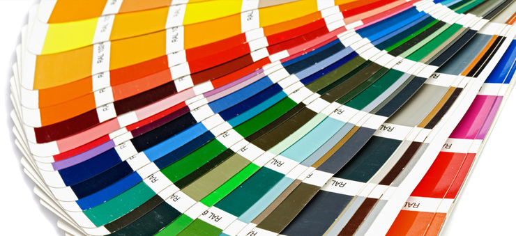
Red—A power color that grabs attention and evokes strong emotions like passion, anger, intensity, hunger and romance; red creates a sense of urgency, hunger and desire. It can turn some people off, however. Red’s complementary color on the color wheel is green.
Orange—A warm, friendly, fair, confident and exciting color. Seems to stimulate appetite. It can be aggressive and induce feelings of caution, however. It’s an impulse-triggering color and many brands use it for their call-to-actions. Its complementary counterpart is blue.
Yellow—A bright, cheerful, youthful color that stimulates thought, awakens the central nervous system and encourages openness, optimism and communication. On the other hand, it can cause eye fatigue. Yellow’s complementary color is purple.
Green—It’s the money/wealth color, but also the natural/organic color. It promotes tranquility, relaxation and emotional pain relief. It’s also a symbol of new life and fertility. It’s very easy on the eyes. Green’s complementary color is red.
Blue—This cool color calms, soothes and is associated with peace; it reminds people of sea and sky. Darker blues invoke images of stability, trust and security. On the color wheel, orange is blue’s complementary color.
Purple—Denotes wisdom, royalty, wealth, success, magic, imagination and creativity. Purple soothes, but can also evoke a sense of mystery. Its complement is yellow.
Pink—Most used to market to young women, pink evokes sweet, romantic and sentimental feelings. It can also denote harmony and friendship.
Black—Serious, bold, classic, sleek, sophisticated, but also heavy and somber; can connote death.
White—Conveys a sense of simplicity, cleanliness and purity. It’s bright, eye-catching, but also blank and open. Frequently used to market health and baby products.
Brown—Brings a sense of stability, reliability, practicality, earthiness and durability. Tera cotta shades are considered upscale.
Naturally, these are all generalities based on western culture, so consider your audience. Different shades and combinations of colors can also impact the emotional response. Brightening a cooler color can raise its energy level; darker shades of warm colors can tone down their passion. Again, you will need your own A/B testing to discover your ideal branding color scheme to trigger engagement from your target market, but use this as a starting point.
The human brain processes color and images 60,000 times faster than text, so don’t take color for granted during your branding and website design process! Optuno’s team of color-savvy designers can help along the way.



 View Printer Friendly Version

